Serenity Chat (JavaScript)
The Serenity Chat JavaScript module allows you to quickly integrate our agents into your site. This module is designed to be as simple as possible to integrate, and it provides a simple API to interact with the agent.
Setup
To add a new instance of the chat component, you'll need to add the following resources to your HTML file:
- Link to the CSS file
- Empty HTML element that will be replaced by the component
- Link to the JS file
- Component initialization script
-
Add the CSS file to the
<head>section of your HTML file:<!-- Add CSS for chat component -->
<link
rel="stylesheet"
href="https://hub.serenitystar.ai/resources/chat.css"
/> -
Add an empty HTML element that will be replaced by the chat component:
<!-- Empty HTML element to be replaced by the component -->
<div id="aihub-chat"></div> -
Add the JS file to the end of the
<body>section of your HTML file:<!-- Add JS for chat component -->
<script src="https://hub.serenitystar.ai/resources/chat.js"></script> -
Initialize the chat component with the following script:
<script>
  document.addEventListener("DOMContentLoaded", function () {
    const chat = new AIHubChat("aihub-chat", {
      apiKey: "<Your API key>",
      agentCode: "<Your Agent Code>",
      baseURL: "https://api.serenitystar.ai/api",
    });
    chat.init();
  });
</script>
If you want to extract the content of current page and send the data to the agent, you can use the Content Extractor feature.
Initialization
You can initialize the chat component by creating a new instance of the AIHubChat class and calling the init method:
const chat = new AIHubChat("aihub-chat", {
  // Configuration options here
});
chat.init();
Configuration Options
The chat component accepts the following configuration options:
{
  apiKey: "<Your API key>",
  agentCode: "<Your Agent Code>",
  baseURL: "https://api.serenitystar.ai/api",
  logoURL: "<URL to the logo image>", // Optional. The URL to the logo image.
  conversationId: "<Conversation ID>", // The ID of the conversation to load. Only required if you want to load an existing conversation.
  mode: "compact", // String that indicates the chat mode (compact, floating, fullscreen, side-panel or floating-side-panel). Default is "floating"
  readOnly: false, // Boolean that indicates whether the chat is read-only.
  scrollToBottom: true, // Boolean that indicates whether the chat should scroll to the bottom by default. Optional. Default is true.
  allowUpload: false, // Boolean that indicates whether file uploads are allowed.
  maxHeight: "500px", // String that indicates the maximum height of the chat component.
  showTermsAndConditions: false, // Boolean that indicates whether the terms and conditions should be displayed.
  showAcceptCommunications: false, // Boolean that indicates whether the accept communications checkbox should be displayed.
  showMetaAnalysisInfo: false, // Boolean that indicates whether the meta analysis info should be displayed on each message. Optional. Default is false.
  showTokenUsageInfo: false, // Boolean that indicates whether the token usage info should be displayed on each message. Optional. Default is false.
  showTimeToFirstTokenInfo: false, // Boolean that indicates whether the time to first token info should be displayed on each message. Optional. Default is false.
  showExecutorTaskLogsInfo: false, // Boolean that indicates whether the executor task logs info should be displayed on each message. Optional. Default is false.
  storeConversation: true, // Boolean that indicates whether the conversation should be stored in local storage.
  expanded: false, // Boolean that indicates whether the chat component is expanded by default. This is only relevant in when mode is floating. Optional. Default is false.
  stream: true, // Boolean that indicates whether the chat should stream responses as they are generated. Optional. Default is true.
  extractPageContent: false, // Boolean that indicates whether the page content should be extracted and sent to the agent. Optional. Default is false.
  userIdentifier: "user123", // String that indicates the user identifier. Optional.
  engagementMessage: {
    enabled: true, // Boolean that indicates whether the engagement message should be displayed. Optional. Default is true.
    message: "Hello, how can I help you?", // The message to display in the engagement message. Optional. It will show the initial message from the agent if not provided.
    showAfter: 10 // The time in seconds after which the engagement message should be displayed. Optional. Default is 10 seconds.
  },
  locale: {
    uploadFileErrorMessage: "", // The error message for file uploads.
    uploadFilesErrorMessage: "", // The error message for multiple file uploads.
    chatErrorMessage: "", // The error message for chat messages.
    headerTitle: "<Chat header title>", // The title of the chat header.
    finalizedMessage: "", // The message displayed when the chat is finalized.
    chooseAnOptionMessage: "", // The message displayed when choosing an option.
    limitExceededMessage: "", // The message displayed when the character limit is exceeded.
    waitUntilMessage: "", // The message displayed when waiting for a response.
    remainingMessage: "", // The message displayed when there are remaining characters.
    termsAndConditionsMessage: "<Your terms and conditions message>", // The terms and conditions message.
    acceptCommunicationsMessage: "<Your accept communications message>", // The accept communications message.
    inputPlaceholder: "write your message here...", // The placeholder text for the chat input.
    metaAnalysisTitle: "Meta Analysis", // The title for the meta analysis card on each message.
    completionUsageTitle: "Completion Usage", // The title for the token completion usage card on each message.
    timeToFirstTokenTitle: "Time to first token", // The title for the time to first token tooltip.
    newChatBtnMessage: "New Chat", // The message for the "New chat" button in the header. (Only visible when storeConversation is true)
    executorTaskLogsTitle: "Executor Task Logs" // The title for the executor task logs card on each message.
    millisecondsUnit: "ms", // The unit for milliseconds,
    exceededMaxNumberOfFilesMessage: "You can only upload up to 5 files per message", // The message displayed when the user tries to upload more than the allowed number of files
    exceededMaxFileStatusChecksMessage: "It seems that the file upload is taking longer than expected. Please try again later.", // Message to display when files are taking longer than expected to upload
    chatInitConversationErrorMessage: "Error initializing conversation", // The error message to display when there is an error initializing the conversation
  },
  theme: {
    header: {
      bgColor: "<Header background color>",
      textColor: "<Text color for the header>",
      resetChatBtn: {
        bgColor: "<Background color for reset button>",
        hoverBgColor: "<Hover background color for reset button>",
        textColor: "<Text color for reset button>",
      },
      minimizeBtn: {
        iconStrokeColor: "<Line Stroke color for the icon in the minimize button>"
      }
    },
    fabButton: {
      bgColor: "<Background color for the fab button>",
      iconStrokeColor: "<Line Stroke color for the icon in the fab button>",
      buttonSize: "<Floating action button size>", // Optional. Default is 50
      iconSize: "<Floating action button icon size>", // Optional. Default is 25
    },
    sendButton: {
      bgColor: "<Background color for the send button>",
      iconStrokeColor: "<Line Stroke color for the icon in the send button>"
    },
    attachments: {
      borderColor: "<Border color for attachments container>",
    },
    engagementMessage: {
      bgColor: "<Background color for the engagement message>",
      textColor: "<Text color for the engagement message>",
    },
    uploadFileBtn: {
      iconStrokeColor: "<Line Stroke color for the icon in the upload file button>"
    },
    messageBubble: {
      user: {
        bgColor: "<Background color for user message bubble>",
        textColor: "<Text color for user message bubble>",
      },
      assistant: {
        bgColor: "<Background color for assistant message bubble>",
        textColor: "<Text color for assistant message bubble>",
      },
    },
    conversationStarters: {
      bgColor: "<Background color for conversation starters>",
      textColor: "<Text color for conversation starters>",
      containerBgColor: "<Background color for conversation starters container>",
      initialMessageBgColor: "<Background color for initial message in conversation starters>",
      initialMessageTextColor: "<Text color for initial message in conversation starters>",
    },
    scrollToBottomIndicator: {
      bgColor: "<Background color for scroll to bottom indicator>",
      iconStrokeColor: "<Line Stroke color for the icon in the scroll to bottom indicator>"
    }
  },
  // Optional input parameters object to send to the agent
  inputParameters: {
    name: "John Doe",
    email: "[email protected]",
  }
};
Presentation modes
You can choose between different presentation modes for the chat component. We have 2 inline modes and 3 floating modes available:
Inline modes
-
compact: The chat component will be displayed as a box. This is useful when you want to manually position the chat component on your page.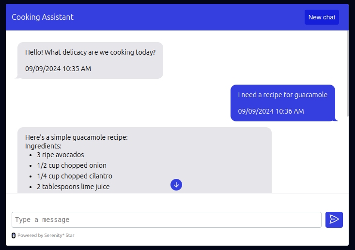
-
fullscreen: Similar to compact mode, but the chat component will take up the entire screen.
Floating modes
Floating modes will always show a floating button on the bottom right corner of the page. When clicked, the chat component will be displayed in different ways:
-
side-panel: The chat component will be displayed as a side panel on the right side of the page, pushing the content to the left.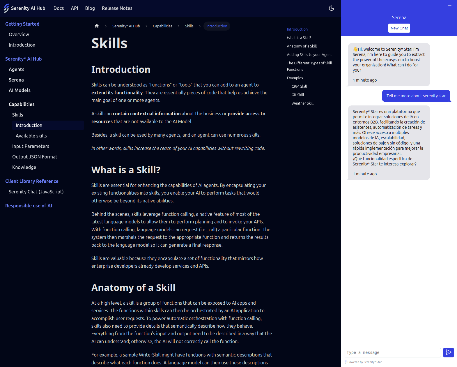
-
floating: The chat component will be displayed as a floating chat window. (Default)
-
floating-side-panel: The chat component will be displayed as a floating side panel on the right side of the page. It won't push the content to the left.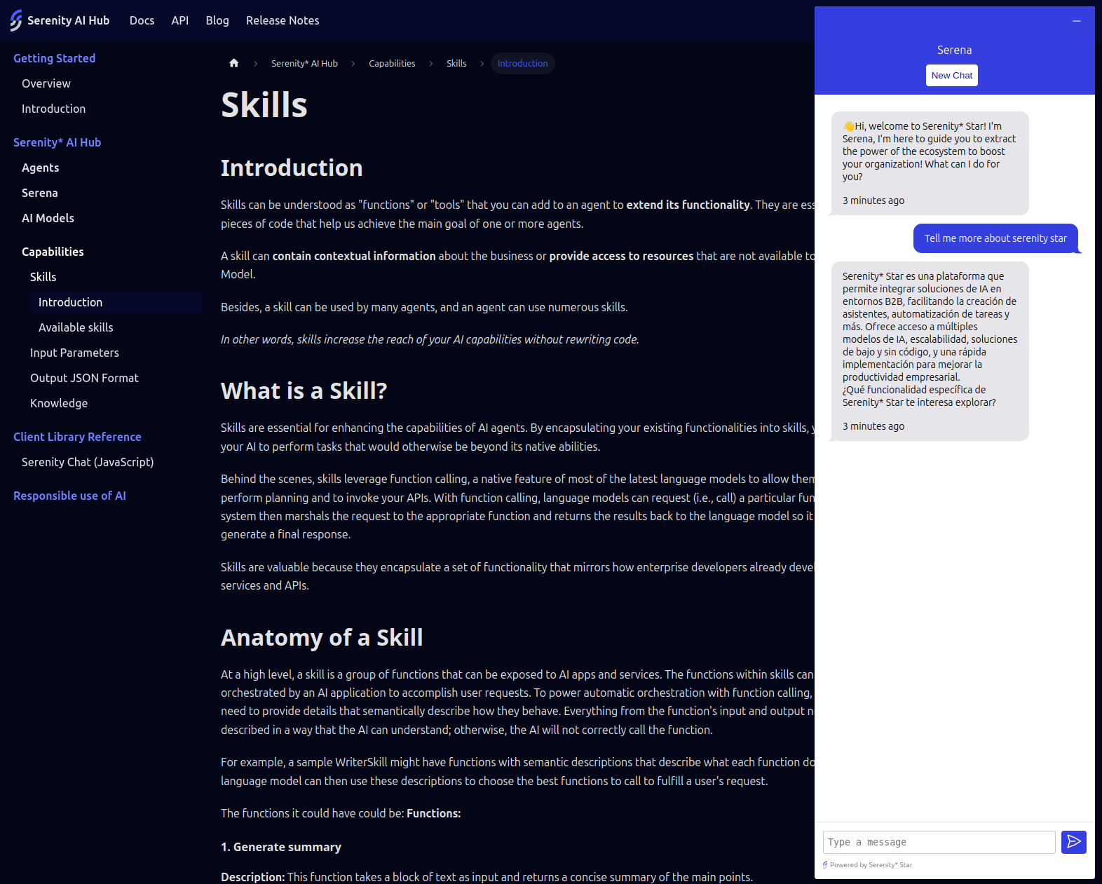
Stream / Single shot responses
You can choose between streaming responses as they are generated, or get a single-shot response at the end.
By default, the chat component will stream responses as they are generated. If you want to get a single-shot response at the end, you can set the stream option to false.
const chat = new AIHubChat("aihub-chat", {
  apiKey: "<Your API key>",
  agentCode: "<Your Agent Code>",
  baseURL: "https://api.serenitystar.ai/api",
  stream: false, // Get a single-shot response at the end
});
Multiple instances on the same page
The chat component supports multiple instances on the same page. You can create multiple instances of the chat component by providing a unique ID for each instance:
<!-- These ids will be used to identify each instance -->
<div id="chat-1"></div>
<div id="chat-2"></div>
const chat1 = new AIHubChat("chat-1", {
  ...
});

const chat2 = new AIHubChat("chat-2", {
  ...
});
Keeping the conversation alive
By default, the chat component will store the current conversation so that the user can continue the conversation even after refreshing the page.
If you want to start a new chat every time the page is refreshed, you can disable this behavior by setting the storeConversation option to false.
const chat = new AIHubChat("aihub-chat", {
  apiKey: "<Your API key>",
  agentCode: "<Your Agent Code>",
  baseURL: "https://api.serenitystar.ai/api",
  storeConversation: false, // Do not store the conversation
});
When
storeConversationis set totrue(by default), the header of the chat component will display a "New Chat" button that allows the user to start a new chat.
You can even keep multiple conversations alive by providing a unique key for each conversation (as mentioned above):
<div id="chat-1"></div>
<div id="chat-2"></div>
const chat1 = new AIHubChat("chat-1", {
  apiKey: "<Your API key>",
  agentCode: "<Your Agent Code>",
  baseURL: "https://api.serenitystar.ai/api",
  storeConversation: true, // Store the conversation in local storage
});

const chat2 = new AIHubChat("chat-2", {
  apiKey: "<Your API key>",
  agentCode: "<Your Agent Code>",
  baseURL: "https://api.serenitystar.ai/api",
  storeConversation: true, // Store the conversation in local storage
});
Customization
There are certain options available to customize the look and feel & general behavior of the chat component:
maxHeight: The maximum height of the chat component. This value will be ignored if the chat is in fullscreen mode.mode: The mode of the chat component. The available options arecompact,floating, andfullscreen,side-panel, andfloating-side-panel. Default isfloating.compact: The chat component will be displayed as a box. This is useful when you want to manually position the chat component on your page.floating: The chat component will be displayed as a floating button in the bottom right corner of the page. This is useful when you want the chat component to be easily accessible. Once clicked, the chat will be displayed as a floating chat window (Default).fullscreen: The chat component will be displayed as a fullscreen chat window. This is useful when you want the chat component to take up the entire screen.side-panel: The chat component will be displayed as a side panel on the right side of the page, pushing the content to the left.floating-side-panel: The chat component will be displayed as a floating side panel on the right side of the page. It won't push the content to the left.
readOnly: Boolean that indicates whether the chat is read-only. When set totrue, the chat will not accept any user input.scrollToBottom: Boolean that indicates whether the chat should scroll to the bottom by default. Optional. Default istrue.allowUpload: Boolean that indicates whether file uploads are allowed.stream: Boolean that indicates whether the chat should stream responses as they are generated. Default istrue.showTermsAndConditions: Boolean that indicates whether the terms and conditions should be displayed before starting the chat.showAcceptCommunications: Boolean that indicates whether the accept communications checkbox should be displayed before starting the chat.expanded: Boolean that indicates whether the chat component is expanded by default. This is only relevant in whenmodeisfloating,side-panel, orfloating-side-panel. Optional. Default isfalse.extractPageContent: Boolean that indicates whether the page content should be extracted and sent to the agent. Optional. Default isfalse.inputParameters: Optional input parameters object to send to the agent. Click here to learn more.userIdentifier: String that indicates the user identifier. This will be sent to the agent only when the conversation starts. Optional.engagementMessage: Object that contains the configuration for the engagement message. Click here to learn more.logoURL: The URL to the logo image. Optional.
Message metadata
You can optionally show metadata for each message, such as meta analysis, token completion usage, and time to first token. All this information is optional and can be enabled/disabled using the following options:
const chat = new AIHubChat("aihub-chat", {
  ..., // Other options
  showMetaAnalysisInfo: true, // Show meta analysis info on each message
  showTokenUsageInfo: true, // Show token usage info on each message
  showTimeToFirstTokenInfo: true, // Show time to first token info on each message
  showExecutorTaskLogsInfo: true, // Show executor task logs info on each message
});
Localization
You can customize the text displayed in the chat component by providing a locale object with the following properties:
uploadFileErrorMessage: The error message for file uploads.uploadFilesErrorMessage: The error message for multiple file uploads.chatErrorMessage: The error message for chat messages.headerTitle: The title of the chat header.finalizedMessage: The message displayed when the chat is finalized.chooseAnOptionMessage: The message displayed when choosing an option.limitExceededMessage: The message displayed when the character limit is exceeded.waitUntilMessage: The message displayed when waiting for a response.remainingMessage: The message displayed when there are remaining characters.termsAndConditionsMessage: The terms and conditions message.acceptCommunicationsMessage: The accept communications message.inputPlaceholder: The placeholder text for the chat input.metaAnalysisTitle: The title for the meta analysis card on each message.completionUsageTitle: The title for the token completion usage card on each message.newChatBtnMessage: The message for the "New chat" button in the header. (Only visible whenstoreConversationistrue)timeToFirstTokenTitle: The title for the time to first token tooltip.executorTaskLogsTitle: The title for the executor task logs card on each message.millisecondsUnit: The unit for milliseconds.exceededMaxNumberOfFilesMessage: The message displayed when the user tries to upload more than the allowed number of files.exceededMaxFileStatusChecksMessage: Message to display when files are taking longer than expected to upload.chatInitConversationErrorMessage: The error message to display when there is an error initializing the conversation.
const chat = new AIHubChat("aihub-chat", {
  ..., // Other options
  locale: {
    uploadFileErrorMessage: "Error uploading file",
    uploadFilesErrorMessage: "Error uploading files",
    chatErrorMessage: "Error sending message",
    headerTitle: "Chat with us",
    finalizedMessage: "Chat finalized",
    chooseAnOptionMessage: "Choose an option",
    limitExceededMessage: "Character limit exceeded",
    waitUntilMessage: "Please wait until we respond",
    remainingMessage: " characters remaining",
    termsAndConditionsMessage: "By using this chat, you agree to our terms",
    acceptCommunicationsMessage: "I agree to receive communications",
    inputPlaceholder: "Write your message here...",
    newChatBtnMessage: "New Chat",
    timeToFirstTokenTitle: "Time to first token",
    executorTaskLogsTitle: "Executor Task Logs",
    millisecondsUnit: "ms",
    exceededMaxNumberOfFilesMessage: "You can only upload up to 5 files per message",
    exceededMaxFileStatusChecksMessage: "It seems that the file upload is taking longer than expected. Please try again later.",
    chatInitConversationErrorMessage: "Error initializing conversation",
  },
});
Theme
You can customize the look and feel of the chat component by providing a theme object with the following properties:
The
themeobject is optional. If not provided, the default theme will be used.
const chat = new AIHubChat("aihub-chat", {
  ...
  theme: {
    header: {
      bgColor: "<Header background color>",
      textColor: "<Text color for the header>",
      resetChatBtn: {
        bgColor: "<Reset chat button background color>",
        hoverBgColor: "<Hover background color for reset chat button>",
        textColor: "<Reset chat button text color>",
      },
      minimizeBtn: {
        iconStrokeColor: "<Line Stroke color for the icon in the minimize button>"
      },
    },
    fabButton: {
      bgColor: "<Floating action button background color>",
      iconStrokeColor: "<Line Stroke color for the icon in the fab button>",
      buttonSize: "<Floating action button size>", // Optional. Default is 50
      iconSize: "<Floating action button icon size>", // Optional. Default is 25
    },
    sendButton: {
      bgColor: "<Send button background color>",
      iconStrokeColor: "<Line Stroke color for the icon in the send button>"
    },
    attachments: {
      borderColor: "<Border color for attachments container>",
    },
    engagementMessage: {
      bgColor: "<Background color for the engagement message>",
      textColor: "<Text color for the engagement message>",
    },
    uploadFileBtn: {
      iconStrokeColor: "<Line Stroke color for the icon in the upload file button>"
    },
    messageBubble: {
      user: {
        bgColor: "<Background color for user message bubble>",
        textColor: "<Text color for user message bubble>",
      },
      assistant: {
        bgColor: "<Background color for assistant message bubble>",
        textColor: "<Text color for assistant message bubble>",
      },
    },
    conversationStarters: {
      bgColor: "<Background color for conversation starters>",
      textColor: "<Text color for conversation starters>",
      containerBgColor: "<Background color for conversation starters container>",
      initialMessageBgColor: "<Background color for initial message in conversation starters>",
      initialMessageTextColor: "<Text color for initial message in conversation starters>",
    },
    scrollToBottomIndicator: {
      bgColor: "<Background color for scroll to bottom indicator>",
      iconStrokeColor: "<Line Stroke color for the icon in the scroll to bottom indicator>"
    }
  }
})
Loading an existing conversation
You can load an existing conversation by using the conversationId option like this:
const chat = new AIHubChat("aihub-chat", {
  apiKey: "<Your API key>",
  agentCode: "<Your Agent Code>",
  baseURL: "https://api.serenitystar.ai/api",
  conversationId: "<Conversation ID>", // <-- Required
});
Extracting the page content
We have a content extractor that can be used to extract the content from the current page and send it to the agent.
This way, you can easily improve the agent response by providing more context about the user's current page.
To use the content extractor, use the extractPageContent flag like this:
<script>
  document.addEventListener("DOMContentLoaded", function () {
    const chat = new AIHubChat("aihub-chat", {
      apiKey: "API_KEY",
      agentCode: "AGENT_CODE",
      baseURL: "https://api.serenitystar.ai/api",
      extractPageContent: true,
    });
    chat.init();
  });
</script>
Input parameters
You can optionally provide input parameters to the agent by using the inputParameters option. This can be useful for providing additional context to the agent.
const chat = new AIHubChat("aihub-chat", {
  apiKey: "<Your API key>",
  agentCode: "<Your Agent Code>",
  baseURL: "https://api.serenitystar.ai/api",
  inputParameters: {
    name: "John Doe",
    email: "[email protected]",
  },
});
These input parameters will be sent to the agent both at the start of the conversation and with each message.
Engagement message
By default, the chat component will display an engagement message (popup) after a certain amount of time.
This message is intended to engage the user and encourage them to start a conversation with the agent.
You can customize the engagement message by providing an engagementMessage object with the following properties:
enabled: Boolean that indicates whether the engagement message should be displayed. Optional. Default istrue.message: The message to display in the engagement message. Optional. It will show the initial message from the agent if not provided.showAfter: The time in seconds after which the engagement message should be displayed. Optional. Default is10seconds.
const chat = new AIHubChat("aihub-chat", {
  apiKey: "<Your API key>",
  agentCode: "<Your Agent Code>",
  baseURL: "https://api.serenitystar.ai/api",
  engagementMessage: {
    enabled: true,
    message: "Hello, how can I help you?",
    showAfter: 10, // seconds
  },
});
If the message is not provided, the initial message from the agent will be displayed instead.
Usage examples
Basic usage
const chat = new AIHubChat("aihub-chat", {
  apiKey: "<Your API key>",
  agentCode: "<Your Agent Code>",
  baseURL: "https://api.serenitystar.ai/api",
});
chat.init();
Read-only mode
const chat = new AIHubChat("aihub-chat", {
  apiKey: "<Your API key>",
  agentCode: "<Your Agent Code>",
  baseURL: "https://api.serenitystar.ai/api",
  readOnly: true,
  messages: [
    {
      sender: "bot",
      createdAt: "2024-04-26T12:00:00Z",
      type: "text",
      value: "Hello, how can I help you?",
    },
    {
      sender: "user",
      createdAt: "2024-04-26T12:01:00Z",
      type: "text",
      value: "Hello, I have a question about cooking recipes",
    },
    {
      sender: "bot",
      createdAt: "2024-04-26T12:02:00Z",
      type: "text",
      value: "Sure, what would you like to know?",
    },
  ],
});